On this page

Everything is selling off. So where is the money actually going?
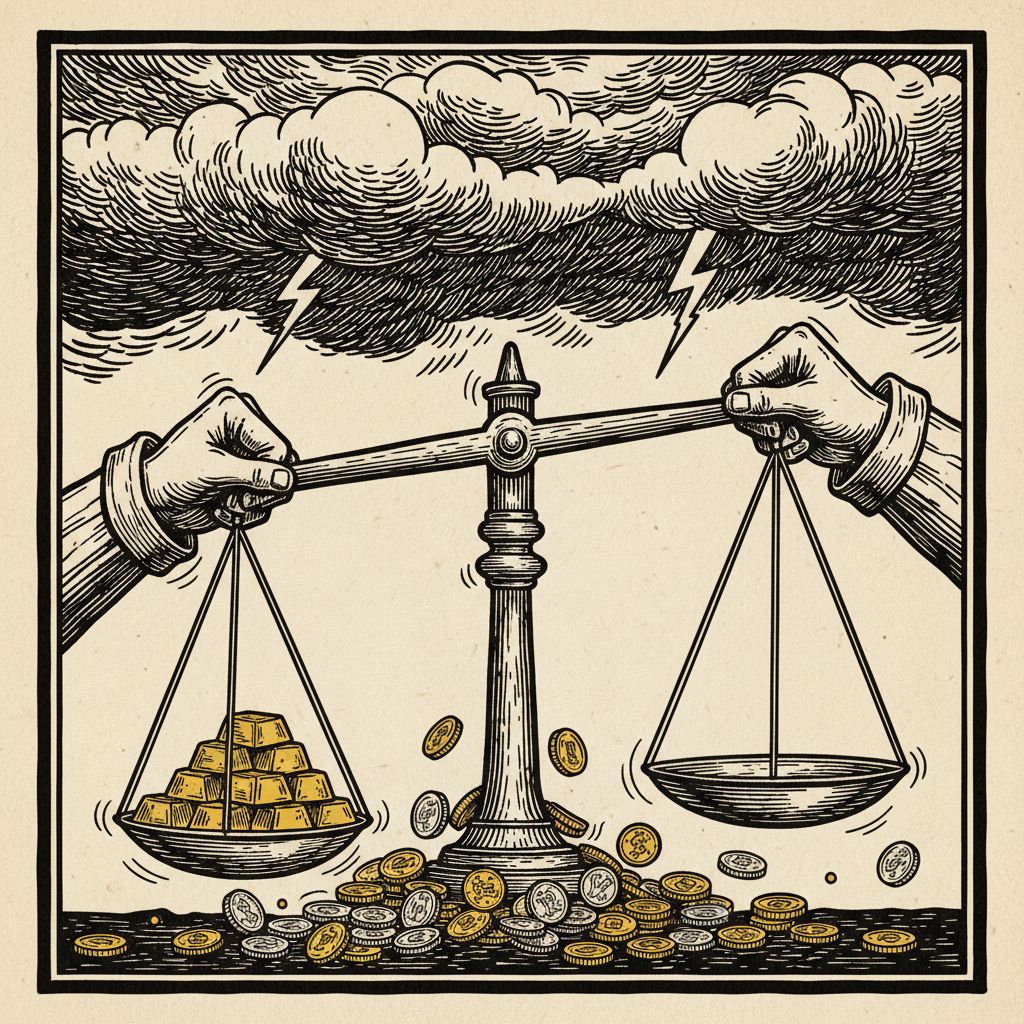
Gold is down. Silver is down. Stocks are down. Bonds are down. If you looked at the headlines this week, you’d think capital was evaporating into thin air. It isn’t. Money doesn’t disappear. It moves - and if you track where it’s moving right now, the picture is less “everything is broken” and more “everything is repricing around a single event nobody expected to last this long.”
The interactive map below shows the full picture. Each node is sized by market cap or dollar magnitude. The streams between them are weighted by relative dollar flow and their speed reflects urgency - panic-driven margin calls move fastest, long-term allocation intent moves slowest. Hover or tap any node for detail.
The trigger
On March 2nd, the United States and Israel launched joint strikes on Iran. Three weeks later, the conflict is still escalating. Energy facilities in Iran and Qatar have been hit. The Strait of Hormuz - through which a staggering share of global oil and LNG moves - is under threat.
Oil has responded accordingly. Prices are up 65% year-to-date. They spiked 35% in just the first twelve days of March alone.
That single move set off a chain reaction that explains nearly everything happening in markets right now:
Oil up → inflation expectations up → Fed forced to hold rates → dollar strengthens → gold and silver crushed → leveraged traders get margin-called → forced selling cascades across asset classes → cash piles up on the sidelines.
One domino. Every market affected.
Where the money is leaving
US equities are the biggest outflow by dollar volume, and it’s not close. The S&P 500 is “only” down about 5% from its January peak - that sounds manageable until you remember this is a $50 trillion-plus market. A 5% decline here destroys more value in absolute terms than the entire gold and silver selloff combined.
The S&P hit its 2026 low on March 13th. The Shiller CAPE ratio is sitting at 39 - a level we’ve only seen twice before: the late 1920s and the year 2000. The economy lost 92,000 jobs in February. Q4 GDP came in at a limp 1.4%. The word nobody wants to say is stagflation. The word everybody is thinking is stagflation.
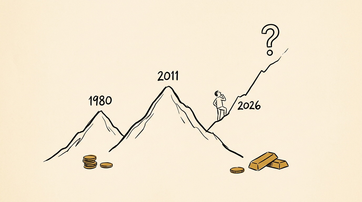
Gold peaked at $5,600 per ounce - a record - before collapsing nearly 18%. Today it’s trading around $4,600. The CME raised margin requirements from 6% to 8%, triggering forced liquidation across leveraged positions. Gold ETF holdings dropped roughly 31 tonnes in March alone. JPMorgan’s 2026 target is still $6,300, though. The structural bull case hasn’t changed. Central banks are still buying. Fiscal deficits aren’t shrinking. This is a shakeout of leveraged traders, not a reversal of the underlying thesis.
Silver got hit hardest in percentage terms. Down 44% from its $120 peak - its worst single-day drop since March 1980. COMEX margins got hiked to 15% from 11%. The meme-driven retail rally that pushed silver from $45 to $120 is unwinding violently. The silver market is roughly $1.5 trillion, though - a fraction of gold’s $14 trillion. Spectacular percentage moves, smaller absolute dollar flows.
Small caps are quietly bleeding worse than the headline indices, down over 8%. Higher borrowing costs are squeezing smaller companies that depend on variable-rate debt and non-bank lending. Cracks are showing in private credit - rising defaults, liquidity problems, the kind of stress that shows up slowly and then all at once.
Where the money is going
Cash. Mountains of it.
$7.82 trillion is now sitting in money market funds. That is an all-time record. Retail funds alone added $10.57 billion in a single week. When you include the broader sideline cash across all vehicles, the figure approaches $9.1 trillion.
This is the dominant flow in the market right now, and it dwarfs everything else. Capital fleeing equities, gold, silver, and leveraged positions is overwhelmingly parking in cash. Not deploying. Not rotating into the next trade. Just sitting. Waiting for clarity.
That $9 trillion is dry powder. When it moves - and it will - it will move markets. The question is what triggers the redeployment: a ceasefire, a rate cut signal, or a selloff severe enough to make valuations genuinely cheap.
Oil and energy are the obvious second destination. When a war disrupts the world’s most critical energy chokepoint, energy assets reprice violently upward. It’s more than price appreciation - new money is entering energy stocks, commodity funds, and futures positions. Energy is the trade of 2026 so far, driven by geopolitics rather than fundamentals.
The US dollar is strengthening, which is unusual during a war. Normally the dollar benefits from flight-to-safety flows, but those typically compete with gold. Right now the dollar is winning that competition outright, because the Fed is holding rates at 3.50-3.75% with a hawkish stance - only one cut projected for the rest of the year. Higher rates attract global capital into dollar-denominated assets. The strong dollar is also why gold and silver are getting crushed: it makes both more expensive for foreign buyers, reducing demand exactly when leveraged traders are being forced to sell.
Short-duration bonds are quietly absorbing capital from investors who want yield without duration risk. Long bonds are getting hammered as the 10-year yield spikes on inflation fears. Treasury bills and short-term instruments offering 3.5-4.2% look attractive when your alternative is equities with a CAPE of 39 and a war in the Middle East.
Bitcoin ETFs are a smaller but persistent flow. $767 million entered US spot Bitcoin ETFs this week. $199 million in a single day. About 19,000 BTC moved off exchanges recently - a signal that holders are moving to long-term storage, not preparing to sell. In dollar terms this is tiny compared to the tsunami flowing into cash and energy. But it’s institutional capital, and it’s sticky.
Private equity rounds out the inflow side, though this is intention rather than execution. The UBS Billionaire Survey shows 49% of billionaires plan to increase their PE exposure. That capital moves over quarters and years, not days and weeks. The stream is real, but it’s the slowest-moving money on the map.
The contested ground
Two asset classes sit in the middle - pulling money in from one side while losing it from another.
AI infrastructure is still the dominant investment theme of the decade. Over $500 billion was spent on data centres in 2025, with $5-8 trillion expected through 2030. AI-linked stocks grew earnings at 30% annually over the past three years versus just 3% for non-AI companies. But the market is getting more selective. A new acronym has entered the vocabulary: “HALO” - Heavy Assets, Low Obsolescence. Investors are increasingly drawn to companies that AI is unlikely to disrupt, not just companies building AI. Money isn’t leaving the AI theme. It’s rotating within it.
International equities are seeing early-stage rotation as investors try to reduce US concentration. The S&P 500 Equal Weight index is up 3.16% year-to-date while the cap-weighted version is down 1.54% - a nearly five-point spread that tells you breadth is broadening and the mega-cap dominance is weakening. Emerging markets are getting renewed attention. Dollar strength is a direct headwind to international allocation, though. This flow accelerates when the dollar weakens. For now, it’s a trickle.
What the map tells you
This is a liquidation event disguised as geopolitics. The Iran war is the catalyst, but the mechanism is mechanical: oil spikes inflation, the Fed can’t cut, the dollar strengthens, leveraged positions across precious metals and equities get margin-called, and the proceeds pile into cash.
The market isn’t confused. It’s doing exactly what it should be doing given the inputs. It’s repricing risk around a world where oil is above $100, the Fed is on hold, and a major war has no clear endpoint.
The most important number on the map isn’t any individual asset price. It’s $7.82 trillion. That’s the weight of indecision. That’s the market saying: I know what I’m selling, but I don’t yet know what I’m buying.
When that cash finds its conviction, the next move will be violent - in whichever direction it flows.
Data sourced from CNBC, Bloomberg, ICI, BlackRock, Morgan Stanley, Fortune, and market feeds as of March 19, 2026. This is commentary and analysis, not financial advice.